Showing posts with label designer. Show all posts

Thursday, 16 May 2019

Secret of Logo Design

Do you think creating Logo design is simple?


Well, only a professional Logo designer can give answer to this question.

A logo is company’s first impression; logo makes an impact on customer’s brand perception and purchase decision.

A Logo talks beyond colours, stylised fonts and graphics; it is a brand’s visual identity.

So, designing a logo is not that simple.

Here in this blog today we will discuss about the secret of Logo design.

Today Logo designers are in high demand and a well-designed logo with a secret message is always catchy.

A 3D Logo designer considers lot of things while designing logo for a company.

Most of the famous Logos carry a significant meaning or hidden message within themselves.

Before designing a Logo for a company you need to do a bit research about the company.

Interview the client to get all the necessary information about the brand.

Learn about the industry and its competition.

Check out the current design trends and client’s need.

Secret Criteria For Logo Design


Logos are born from Research.


Each and every logo which is famous now is the result of extensive research.

Understanding the need of the client is important.

Collect the information like – who are the client, what they do, how they work and what is their target market.

Go through the previous logo if available and then think about the upgrade version.

Do research online to get inspiration.

Research of the target audience or customer is also necessary.

Giving value to customer’s perception and designing the logo in such a way that it will not hurt sentiments of the people is necessary.

Logo design is not only about creating an appealing visual but also building up a brand.

The logo should communicate between the client and its target customer; so market research is important.

Logo design should be simple so that customer can easily register the brand in their mind.


Explore With Typography Critical Thinking, Creative and Planning is the basic rule.

To create a design for logo the best way is to use pen and pencil to sketch out the ideas.

Sketching with help to do experiment freely; you need to save the sketches for the future reference also.

Take care of the pencil strokes or shades while designing the logo; use the alphabets in a stylised way.

Typography is the main part of an effective logo.

Either one can create a customized typeface or use a pre-set one.

Keep the typeface simple, readable and classy.

After doing the pen and pencil sketch, work on computer software to design Logo.


Today software comes with in-built typography; the artist can do research and then select the appropriate typography suitable for the brand.

The artist can use typography to embed hidden message in the Logo.

Experiment with typography will help the artist to build corporate identity.

Letters and typography style should be used in such a way that it could create a hidden figure as a message of a company.

Typography is subject to trends, so choose the font carefully.

A logo helps to distinguish a brand from its competitors, so it’s important to make the image of the logo unique from the rest.


Play with Symbols


In the above picture we can see very familiar symbols which we come across in our daily life.

Brand message can be easily conveyed through symbols.

Give your logo a unique symbol so that the people can remember it easily.

A simple test or a simple image is easy to memorise rather than the complex one.

For logo designing get inspired from different resources such as design centric websites.

Something which will make you happy is the potential root of an awesome idea.


Select the Colour Tactfully


While designing logo, colours play an important role.

Bright and bold colours grab’s the attention more easily.

Every colour has its own significance and it can add fresh idea or message to the logo.

Each colour has its own property such as Red is for energetic; Orange creative, Green is for growth, Pink is for fun etc.

Choose the colour from the company’s other graphic designs.


For example this NBC (National Broadcast Company) Logo has many colours and it shows the features of a peacock.

Here colours are used in such a way that we can see peacock in Logo design.

To add hidden message in the logo use the space carefully to add colours.

Colours should be used tactically.

Keep the Design Simple


A simple Logo is easy to remember, avoid putting too much detail into the concept.

Simple Logos are easy to recognise from a distance.

Choose the easy to read font.

It is not necessary to show what the company does in the logo, example Marlboro Logo doesn’t have a cigarette or BMW doesn’t show a car.

A logo works as identification for the company.

A well-designed logo represents the so called company and what that company stands for.

A good designed logo also helps the public to differentiate it from the other competitors.


A logo appears on many platforms such as websites, business cards, billboards etc.

Logo should have flexible size and content depending upon on which platform it appears.

A good logo design works on printed materials as well as various digital platforms like mobile devices.

Avoid using too much of effect as the logo need to look great across different platforms.

Lots of effect may make the logo beautiful but it won’t be translate well to different media platforms.

Start with ordinary black and white effect and then do experiments with other colour contrasts.


Timeless

If you look at Coca-Cola Logo, it hasn’t changed much since 1885.

Design a logo which will be effective for 10, 20 or more years.

Think about the longevity and not about few months or years.

Trends will come and go but the logo should undergo the ages.

Get to know more about Logo Design by joining our MAAC Kolkata Centres

Sunday, 27 January 2019

Many Faces Of Graphic Design


Here you have many faces for graphic Design today we will discuss in our blog different aspect of grapic design from the eye of graphic designer.


There are plenty of job opportunities in the market today for a Graphic Designer.

A graphic designer communicates visually through the use of typography, photography and illustration.

Graphic designer creates symbols, images and text to deliver ideas and messages.

Fields where Graphic designs are used include Corporate design, editorial design, environmental design, advertising, web design, communication design and other.

Graphic design helps in selling a product or idea. Logo, colour, packaging and text are part of creating a brand identity.

Graphic Designers plays an important role in a branding team.

From Story books to Newspaper, the display of opinion and facts can be improved with graphics and visual information.

A skilled designer work hard in stylization of a text. He / She deals with art and technique of arranging type (Typography) to make written language readable and appealing while display.

Graphic designer should have good skill of communication.

Graphic Designer working on digital computers needs to be more skilled in image-making, typography and layout.

The field of Graphic Design is growing and the demand for specialized and skilled designers is high.


Marketing and Advertising Graphic Design

From making a product visually attractive to launching it into the market for customer satisfaction need understanding of the demand of customer.

Marketing of a product depends upon People’s need, awareness and satisfaction.

People always find visual content more attractive and engaging.

A company can promote and communicate more effectively through graphic design.

The Marketing Designer works with company owners, directors, managers or marketing professionals to create assets for marketing strategies.

Even custom T-Shirts can help the companies in building a brand identity.

T-Shirts carry the brand message in a more casual and friendly way. A well designed T-Shirts with Logo or company name catches the attention of masses more easily.

Vehicle advertising or Vehicle Wrap is the most economic form of outdoor advertising.

By using proper colour, Image, Logo design, photograph in vehicle warp; the message becomes attractive.

Types of Marketing Graphic Design are:-

Postcards, Flyers and Vehicle wraps

Magazine and Newspaper Advertisements

Posters, Banners, Billboards and Brochures

Signage and trade show displays

Images of Websites and blogs

PowerPoint Presentations and etc.

Marketing Designer should have problem solving attitude, excellent communication and time management skills.

Business Card


Publication Graphic Design

Thoughtful combination of Text and Image to support the content; is an important part of Publication Design.

Books, Newspapers, Magazines, Annual Reports, Directories, Newsletter and Catalogues fall under Publication Design.

Sometimes we buy books by looking at its cover; the cover of a book communicates a story and message through colours, fonts, images, symbols etc.

For Research report, Graphic Designer can display data through charts or Info-graphics whereas for Alumni Magazine designer adds illustrations to make the article catchy.

In Publication Designing, the print materials should be on time, on budget and without complication.

Skilled Graphic Designers work with Editors and Publishers to create Layouts with selected Typography, Photography, Graphics and Illustrations, infographics.

Designer should take care of Footnotes, Folios or Active links for a web version, copyrights, photo credits and many more in Multi-page layouts.

The Stationary items help to popularise business.

Things like Letterheads, Business Cards, Folders or Envelops etc. Shows professionalism and make impression on clients.

Packaging Graphic Design

A correctly and creatively done packaging draws attentions, sends message and sells product to the customer.

All products need packaging for storage, distribution and sale.

Packaging Design is a valuable marketing tool, as it communicates directly with the consumer. Each and every box, bottle, bag, can, container tells the story of a brand.

A Catchy Label Designing of a product; differentiate it from other product in the supermarket.

Label Designing includes the information of its maker, manufacturing and expiry date, ingredients, warnings etc.

In Packaging Industry, many types of symbols are Nationally and Internationally standardised. Such as a green dot convey that the packaging can be recycled.

Packaging Designers should have expert knowledge of print processes and a eager understanding of Industrial design and Manufacturing.

Packaging Designer should be Bold, Creative and Think out of the box.


Motion Graphic Design

The Graphics in motion are called Motion Graphics; such as animation audio, typography, Imagery and Video.

For example Kinetic Typography and Graphics used in film and television opening sequences, three dimensional station identification logos of some television channels.

Motion Graphic Designs are used by motion graphic designer in openings of Movies, Television Shows and News Programs to make the introduction more entertaining.

Computer Software like Adobe After Effects, Adobe Flash and other helps to create Motion Graphics.

Motion Graphics can be used in the:- Title sequences and end credits, Advertisements, Animated Logos, Trailers, Presentations, Tutorial videos, Websites, Apps, Video Games and Banners.

Environmental Graphic Design

Visually connecting people to places to improve their overall experience by making spaces more memorable, interesting, informative and easier to navigate is the work of Environmental Graphic Designer.

This section includes elements of graphic design, architecture, Interior design, landscape design and industrial design.

Environmental Graphic Designers activate places and create efficient navigation solution.

Providing signs in the environment is an old art, as cave men used to tell stories through paintings on the walls of their caves.

Types of Environmental Graphic Design includes- Signage, Wall murals, Museum Exhibitions, Office Branding, Public transportation navigation, Retail store interiors, Stadium branding, event and conference spaces.

The ‘Way finding’ type of environmental graphic design consists of strategic signage, landmarks and visual cues that help people identify where they are and where they need to go without confusion.

Sign Boards, Kiosks or Maps in Hospitals, Museums or any public places proved to be great help for the common public to find the appropriate place where they want to go.


User Interface Graphic Design

At present situation we cannot think life without Mobile Phones; we spend a lot of time on apps.

Mobile App Design makes an App Successful. Professional mobile app designer knows how to design an app with elegant interface, perfect icons and colourful art.

The User Interface (UI) design focuses on the user’s visual experience and the design of on-screen graphic elements like buttons, menus, micro-interactions and more.

UI designers become specialize in Desktop Apps, Mobile Apps, Web Apps and games.

They work together with User Experience Designers (UX) who decides how the app works and with UI Developers who write code to make it work.

Types of User Interface Graphic Design are- Web page design, Theme design, Game Interfaces and App design.

Along with Graphic Apps UI Designers need knowledge of programming languages like HTML, CSS and Java Script.

Hope you all got the idea how this arena of career can be.

So come and connected with our expert counseling team to advise you on right career just a call away @9836321595.

Sunday, 23 September 2018

Acknowledge The Advantages Of Graphic Designing

Graphic designing is known for its art of summing up for the purpose of promoting the brand or a company.

There are graphics everywhere in the area of business.

The majority of people use graphics in order to convey a message by means of symbols.

As for example, the road signs are viewed for the purpose of guiding people in order to drive carefully, at highways.

You have also come across signals of hotels, restaurants as well as petrol pumps.

All these things are graphics.

The time when it comes to the creation of a website, the pictures utilized on the website are Graphic Designing.

It plays a very significant role in the creation of a website.

Web designing comprises of Graphics, Company logo as well as texts.

It is quite certain that a website with some mere texts is not that much eye-catching as a website with fantastic graphics.

It is very complicated and difficult for a user to follow.

Only texts cannot improve the credibility of the website but the addition of graphics can be used to amplify the traffic of a website.

Graphic Designing is vital for Web Designing


During the time of planning of a website, you have had to hire an expert web designer in India.

MAAC   Kolkata is the very trustworthy place where you get effective training in graphic designing.

MAAC Chowringhee, MAAC Ultadanga, and MAAC Rashbehari consider the various following factors, quality of content, navigation as well as certain aesthetics of designing website.

Graphic designing is considered as vital for a website and it is important for web designing too as because graphics are the foremost important thing that visitors and viewers notice on a website.

A graphic designer feels it beneficial to combine the graphics as well as texts in an absolute manner in order to make a website more fascinating and attractive.

Benefits of Graphic Designing

The website is not made and created for the sole purpose of visitors but it is created for converting visitors into customers.


At the time when users find your websites on the search engine, it is the duty of the graphics designers to take care of the site that it contains some fascinating graphics.

It is crucial to feature and concentrate the main points of the website.

Augmenting The Business


It isn’t vital to get the guests to the site; we change over the guests into clients, which increment the business.

A site with great illustrations passes on the features effectively.

Battling Competition


From the minute a site is outlined, it comes into rivalry with different sites of a similar classification.

Be that as it may, alluring designs and great quality substance enables your site to the battle tuff rivalry.

A site containing a message just as content is exceptionally uninteresting and is not really perused and taken after by guests.

Advertising and Marketing


Graphics Designing mixes writings with illustrations to make a site instructive and intriguing at the same time.

So guests don’t need to experience the long instructive and informative messages.

Illustrations efficiently feature the message you need to pass on.

An imperative site welcomes more guests and importantly expands the business by changing over guests into clients.

For the present, your guests get the coveted data without being mistaking and overpowered for the unnecessary data about the organization.

Along these lines, it likewise enables you to accomplish the set goal productively.

Graphics Designing is additionally used to enhance the outward appearance of items.

The item or administration you offer is accessible to different organizations and brands too.

Nonetheless, an item which is alluringly bundled gets the consideration of shoppers in the showcase.

Your client will know the nature of your item after it is utilized.

It is the outward appearance of your item which impacts the client most in any case.

The review estimation of an all-around composed item or site is significantly higher.

A client can overlook the name and message of a brand, be that as it may, the visual message as pictures endures longer.

A noteworthy Graphics Design influences the client to recall it and expands enthusiasm for purchasing the item or administrations.

There are numerous organizations in the market with whom you need to contend with.

How you show your organization in virtual and true with the illustrations impacts the way individuals see you.

Realistic planning can enhance the status of your organization in the commercial center on being utilized systematically.

Realistic planning can be utilized to make a steady search for a brand or organization its different crosswise over items, sites and promoting exercises.

This enables an organization to build up and reinforce its picture in the market which individuals can acclimate themselves with.

It, in the long run, lessens the time and cash that goes into advertising and marketing.

Fabricate Trust, Goodwill, and Loyalty


A very much planned brand makes an expert appearance that constructs trust and believability, which is fundamental to developing your business.

Your image encourages solidarity and duty among your workers by giving them a personality and qualities to rally behind and advance.

Trust assumes a critical part in persuading purchasers about the nature of your items or administrations.

Organizations that flourish are ones that have built up a brand that is trusted.

The great plan assumes a key part of making correspondence that can upgrade that trust.

Increment Sales and Market Position


With great visual computerization, you increase high permeability, as well as change over your gathering of people into purchasers, prompting expanded deals.

The greater part of the above advantages can add to one effective outcome: more deals and income for your business.

A Strategic Investment


Maintaining a business is a long haul responsibility.

In the present consistently developing the commercial center, emerging is winding up increasingly troublesome.

Utilizing great plan to build up your character and brand is an incredible method to impart your identity, what you do and why it is imperative.

The utilization of good outline can enhance numerous parts of your business.

Get in touch with us to discover how we can enable you to fortify your correspondence, advertising, and brand through visual depiction.

Conclusion

Graphics Designing is a fundamental piece of web outlining that encourages you to construct a brand picture for your organization.

We guarantee you that every one of the necessities is viewed as key variables for making a decent site.

To know more, click here to register.

Monday, 10 September 2018

A Digital Roadmap To Interaction Design

Interaction design is derived from its primordial origins that is deep-rooted in web and graphic design.

However, it has grown to a new realm on its own.

A way distant from the mere working with the texts and pictures, the designers that are in the field of interaction designing are, these days, responsible for the creation of every component on the screen that a consumer should swipe, tap, type or even click.

It can be said that interaction has become a part of the market industrial purposes.

This blog post is written with a view to serving as a good jumping point for the pupil who is quite interested in learning more about Interaction Design.

In this piece, we’re going to encompass areas of the history, guided values, notable contributors, in addition to devices that are associated to this amazing field.


Since the past few years, a number of books as well as journals have been released which explained the various aspects of Interaction design.

Interaction Design can be defined as the structure as well as the manner of interactive systems.

These designers go all-out to make and produce a significant relationship between the people and the products in addition to the services that they utilize, perhaps from computers to mobile devices to appliances and beyond.

What are the general procedures?

Interaction Design Animation kolkata

Nevertheless, the interaction design expands varied kinds of the web as well as mobile applications in addition to websites, this comprises of some approaches on which every designer believe.

We’ll investigate a portion of the more typical procedures here: objective driven plan, ease of use, the five dimensions, subjective psychology, and human interface rules.

Objective-driven Design


This methodology was set by Alan Cooper during the year 1999.

It involves some important processes that needs five extravagant shifts in the method as the Interaction designers think and contemplate.

Prime Important Design, Second is Program

As such, objective driven outline starts with contemplations for how clients cooperate (and what things look like!), as opposed to starting with specialized contemplations.

Isolate Responsible Duty Regarding Design From Obligation for Programming


This alludes to the need of having a Interaction Designer who can champion the end-client, without agonizing over the specialized requirements.

A designer ought to have the capacity to believe his or her engineer to deal with the specialized viewpoints; in certainty, Alan Cooper recommends that to do generally puts the creator in an irreconcilable situation.

Consider Designers in charge of item quality and client fulfillment

Despite the fact that partners or customers will have their own particular targets, the collaboration creator has an obligation to the individual on the opposite side of the screen.

Characterize One Particular Client for your Item

This specific thought has formed into something that is presently more ordinarily connected with client look into: personas.

However Alan reminds us to associate personas back to the item, and continually ask: where will this individual utilize this? Who is he or she?

What does he or she need to achieve?


Work in groups of two

Ultimately, connection architects ought to never work in a storehouse. Joint effort with others, which Alan Cooper calls an “Design communicator,” is vital.

In spite of the fact that the outline communicator Alan imagined in 1999 was commonly a publicist proposed to give advertising duplicate to items, today that has extended to incorporate an undertaking director, content strategist, data planner, and numerous others.

Ease of Use

Well the term ‘ease of use’ may appear to you an indistinct expression.

However, in heart, designers are simply of the question that is it really usable in the long run.

Nielsen and Schneiderman are of the opinion that ease of use as being made up of few codes: Learnability, Understandability, Memorability, Errors, User Satisfaction, Attractiveness, Usability Compliance.

What are the Five Dimensions?


1Dimension: The phrases and words should be easy to understand as well as written in a way that interact data very conveniently to the final user.

2Dimension: Visual representations or illustrations are characterized by graphics and illustrations and not in text.

3Dimension: Physical objects or space can be characterized by physical hardware, perhaps it may be a mouse or a mobile device with which the consumer communicates.

4Dimension: Time speaks everything.

Time is the length that the client goes through collaborating with the initial three measurements.

It incorporates the manners by which the client may quantify advance, and in addition sound and Animation.

5Dimension: This point was amplified by Kevin Silver.

This point characterizes the emotions and sentiments that the user feels while working, connecting and interacting with a system.

Subjective Psychology


Intellectual brain science is the investigation of how the mind functions, and what mental procedures that happen there.

As per the American Psychological Association, these procedures incorporate “consideration, dialect utilize, memory, recognition, critical thinking, innovativeness, and considering.”

Human Interface Guidelines


This segment is somewhat of a misnomer; there really is no single arrangement of human interface rules.

Notwithstanding, the thought behind making human interface rules is in itself an approach.

Rules have been made by most significant innovation plan organizations, including Apple and Android, Java and Windows. The objective is the same for every one of them: to alarm forthcoming fashioners and designers to guidance and suggestions that will help them to make all around instinctive interfaces and projects.

Wireframes of Key Interactions


After the connection fashioner has a smart thought of the technique spurring her outline, she can start to portray the interfaces that will encourage the vital associations.

The fallen angel here lies in the points of interest: a few experts will actually portray these cooperations on a cushion/dry-eradicate board while others will utilize web applications to help them simultaneously, and some will utilize a blend thereof.

A few experts will make these interfaces cooperatively while others will make only them.

Everything relies upon the association architect and his or her specific work process.

Design Approach


Despite the fact that the limits here are fluffy, one this is sure: a connection originator should know her identity planning for and what the client’s objectives are.

Ordinarily, this is given to her by a client specialist.

Thus, a cooperation creator will survey the objectives and build up a planning methodology, either freely or with assistance from different planners in her group.

A design need to happen to encourage client objectives.

This piece is written as per the guidance of the experts MAAC Kolkata faculties who are seasoned enough to train you to prepare yourself job-ready in the market scenario.

Click here to register with us.

Wednesday, 8 August 2018

Composition of Photography Strategies Constituents of Design

Components of configuration assume a noteworthy part in creating a photo in a way that is comprehended by the watcher deliberately or unknowingly.


The artists and the painters depend intensely on the various components of design at the time when they make the craftsmanship.

Photography composition and analyzing the design of the photography is presumably the crucial prerequisite for any craftsman to comprehend these components keeping in mind the end goal to design their fine art.

However tragically, it is not the same with the greater part of the photographers.

A few of the photographers are well aware of the various composition strategies of photography.

The vast majority of the photographers most likely will learn only the Rule of Thirds and Leading Lines organization systems and stick to them.

In the event that you are one of them, at that point, you would be astonished to see that there is parcel more than administering of thirds and driving lines.

Components of Design in Photography


The elements of photography will open up plenty of chances in order to take the advantage of the inventive side of you.

Here, you will begin to create your design by artwork and craftsmanship than a photographer but he is restricted to some standards.

Let us hop into the design here.

The Elements of Design


The seven most significant elements of design in Photography are line, shape, form, texture, pattern, color and space.

Each and every component assist you to design your photo such as a path, but it is done to the point that it emphasizes either vital perspective in structure.

In this article by MAAC Chowringhee, MAAC Rashbehari, and MAAC Ultadanga you are taken to the components of the design.

Line


In the field of photography, the line is the most crucial element of all.

In addition to it, the line is the most grounded components of all.

Your eyes take the line whether it is obvious or undetectable.

In light of its character as well as direction, lines convey feelings making it one of the most active elements of design.

Flat and horizontal lines recommend the feeling of relaxation and smoothness.

Vertical lines propose the feeling of energy and diagonal lines recommend the feeling of development along with direction.

In case of soft curved lines, it represents relaxation or unwinding feel while barbed and jagged lines put forward frenzy as well as chaotic lines.

Shape


Shape is a very necessary element in photography.

The shape is considered as a two-dimensional portrayal of an object.

Children draw basically utilizing the shapes like a diagram of a homestead house, a tree, sun, and so on.

The external line of a question frames the shape.

In photography, you can speak to intriguing states of the items by utilizing outline impact because of backdrop illumination.

Photos of designs have an effect when the state of the subject (protest) is obviously characterized interestingly with the foundation.

Form


The form is another important aspect in terms of pictures or photographs.

The form is regarded as a three-dimensional portrayal of an object.

The form can be defined as a third measurement of the shape.

Photography (and workmanship) is a two-dimensional shape without the profundity which represents a test to you as a picture taker to by one means or another speak to the third measurement by making a fantasy of profundity.

By utilizing light and shadow you can make a fantasy of profundity in your photo.

Texture in Photography


Texture can be defined as the representation of the details and the points of interest that are available on the surface of an object.

In light of the disposition you need to pass on in your photo, you will either sit tight for the light that will accentuate the harshness or delicate quality of a question.

Colour Shading

Colour shading is considered as a noteworthy design component that all adore.

Hues assume a critical part to set the temperament of the photo.

The hues (colors) can be broadly designated as warm colors and cool colors.

The three colors- red, orange and yellow make a trio and also suggest the feeling of warmth, vivacity and enthusiastic.

Besides warm colors, there are cool colors which are blue and green.

This suggests the sentiment serenity, peacefulness, and tragic/melancholy.

Space


Space is considered as another imperative element of design that suggest the separation between the articles, point of view and also extents of items.

Here, a subject matter delineates the optimistic space in a picture along with the background which represents the negative space.

A place should always remain allocated whether it is a positive space or a negative space.

Negative space is as vital as the positive space fit as a fiddle of the subject.

Space makes a subject vibe agreeable in the picture if made utilizing the preclude of thirds.

Pattern


Patterns are known by their repetition of shapes or textures which are needed to be assembled in a very rhythmic way.

If you get some moment out of your precious time, then you can look for patterns in nature as well as in the man-made things.

With the assistance of these patterns, you can create a visually compelling picture that can keep the viewers engrossed in the clicked image.

At times breaking through this synchronization and rhythm in pattern yields much better outcomes by acquiescing a dynamic composition

Final Conclusion

In this blog the elements of design are explained above that forms an active composition and establishment of the good composition of photography.

We believe this blog will be beneficial to people who are craving for some assisting guidance towards the career of photography.

To all photographers on the floor, it is time to ask yourself whether you people utilize components of design intentionally in your photos?

What components of configuration do you think makes a photo more convincing than the other?

Are you interested to know more about this topic?

You’re most welcome to MAAC Kolkata as it proffers quality education and training on courses l

Wednesday, 25 July 2018

Learning the Fundamental Elements of Graphics Phase


Here, in this blog, you are led to the blog post where today MAAC Kolkata is presenting to you the different principles and basic elements of Graphics so that you can have a brief idea of the distinct basics of Graphics.


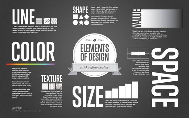
There are overall six elements of a design which you need to be conscious of the line, shape, value, texture, color, and space.

Considering The Line


The line is that part of the elemental graphics designing which is more often than not present in every design, even though it is a solid border of 1px or may be one of 5px.

Each and every website has lines, however, some other thing became popular in it.

During the last few years, there is a descent in the utilization of lines from the layouts.

There are varieties of lines that can be long red, blue, thin, straightforward, black, short or dashed.

This is all in the similar category.

Most of the times, they are utilized for certain constraints between diverse sections of a design or are utilized to show the way a viewer’s vision towards a particular direction.

These lines have the capability to create distinct effects and Visual impacts.

At the time when a thick, bold line draws attention as a consequence of its visual power, then all the thin lines lean to go to the other way.

The brightness and darkness of the colors also affect the line such as dark colors are simpler to see and draw more sketch more concentration and attention than light or pale colors.

The style of a line can likewise impact the way the client sees it.

This style can undoubtedly be characterized by CSS and can be strong, dabbed and dashed among others.

The strong lines have an unexpected effect in comparison to the speckled ones since they are additionally forcing.

The moderate style which I’ve discussed before utilizes either less strong lines or more bent lines since they give a dynamic and liquid look to an outline, which is additionally the reason for the style.

They show vitality, keep the client intrigued and, if joined with representation, are intense to the human eye.

Numerous years prior strong lines were exceptionally well known on the grounds that they decided the style of the plan: inflexible, strong and sorted out.

The web changed in the previous years and this style isn’t extremely prevalent any longer, particularly for planners’ portfolios and different pages with a solid need of an individual touch.

The Shape is important in Graphics


The shape is another element of Graphics.

This form or shape is regarded as the second most utilized element of web design.

In fact, they are the lines combined in distinct shapes.

The shapes and forms are yet today famous, and the reason of this is if there is something that requires emerging, then forms are the custom methods to do it.

There is a possibility to have circles, rectangles, triangles, squares and many another abstract shape.

However, most of the designs comprise of by degrees one of it.

Minimalistic designs are usually depended on illustrations as well as drawings and that is why this type of designs are abundant.

The traditional style of designing websites and web pages consists of shapes too, so they remained popular all the way through time and will possibly advance being like that.

Textures are really vital


The textures were not extremely famous two or three years back, but rather they have a tendency to wind up increasingly utilized.

They supplanted (or contend with, in the event that we can call it an opposition) the single-shaded foundations as well as backgrounds.

Surfaces can appear to be like strong foundation hues, yet in the event that they are broke down closer, little however viable contrasts can be taken note.

Surface styles incorporate paper, stone, solid, block, texture and common components, among level or smooth hues.

Surfaces can likewise be unobtrusive or articulated and can be utilized sparingly or generously.

They work with practically everything.

Regardless of whether they don’t appear to be imperative, the surfaces can absolutely change a site and offer a very surprising visual effect.

Drop Down Colors


If you’re a master of colors then you might make a difference between an excellent design and an intermediate one.

So you have to focus on color theory.

The color can be the most significant element of a graphics design as it proffers the maximum strong vision and Visual impact at a single glance.

Color is something which is obvious to draw attention to, it does not need any elementary graphics skills to be noticed.

At the times when lines, as well as shapes, denote the similar thing in case of reality, just a bit more deep level of the color notifies absolutely the identical thing as in case of nature.

Color Shading makes feelings – red is energetic, blue is quiet, green is characteristic.

Studies have been done and a man who lives in a red situation has a higher pulse and heartbeat than a man living in a blue domain/environment.

The human mind sees this and impacts whatever is left of the body.

Along these lines, shading hypothesis is critical to know, in light of the fact that relatively few creators can call themselves specialists in this field.

Being an ace of hues may have the effect of a decent plan and a dazzling one.

Concentrate on the Value of Graphics Design


Value is quite closely related to color as because the value is basic and general and in addition, it corresponds to how dark or light a design is.

On the front of graphics, the value had a lot more to do with mood, however, just at a more insightful level.

Understanding hues will take you near flawlessness, however knowing how esteem works will take you past this.

Lighter plans offer an alternate effect and feeling than the dim ones and you require a specialist eye to see contrasts and choose which one is the best.

Give some Space


Space and how it is utilized is significantly imperative in outline.

Recently the “blank area” (additionally called negative space) wound up utilized broadly in light of the fact that it enables the human eye to peruse simpler.

For whoever isn’t comfortable with the expression “blank area”, it doesn’t mean accurately space loaded with white, yet every region of the plan which is just loaded with the foundation shading.

You can see a few cases beneath to better comprehend the idea.

In the event that there is a considerable measure of negative space in your website composition, it offers light and an open feeling.

The absence of void area will transform your plan into an out-dated, jumbled one.

Space has likewise a great deal to do with how the plan is seen by the human eye.

Are you interested to get a precise knowledge of Graphics Design, then no other place can be better than MAAC Chowringhee, MAAC Ultadanga and MAAC Rashbehari.

The institute administers effective training on certain valuable training subjects like 2D Animation, 3D Animation, Visual Effects, Graphics Designing, Multimedia, Game Designing, Web designing, and other architectural courses.

To know more click here to register.

Sunday, 24 June 2018

Distinguished Illustration Trends In 2018


In today’s blog presented by the MAAC Kolkata centres of Chowringhee, Rashbehari and Ultadanga with a view to let the designers know about the distinct illustration trends that are present before them.

 Remain on the ball with this breakdown of the best patterns we think will characterize print outlines and delineations in the up and coming year.

From modernized retro typography to hyper-genuine representation, and an appreciated return of everything maximalist, 2018 will be an expanding year for inventiveness.

The blog is laid before you to give you a clear idea about the diverse illustration trends and designs for designers in the year 2018.

Pattern #1: Modern Script Typography


Prepared for enormous advancements in typography? We certainly are.

With type innovation quick advancing, type Illustration designers will be ready to grow further developed textual styles which make complex styles, angles, gradients and surfaces in a flash available to print creators.

Tying in with the proceeded with the slant for everything hand-drawn, we’re beginning to see more calligraphy-motivated text styles and lettering Illustration designs.

This style in itself isn’t totally new, however, the most recent product of content textual styles are cutting out their own particular specialty.


With an unmistakably present-day feel, these contents make utilization of expertly drawn lines, hues and profundity to make a particular one of a kind disposition.


This Lingerie XO textual style by New York planner-designer Moshik Nadav encapsulates this cutting-edge content pattern.

Taking its signs from the sentiment of customary calligraphy it, in any case, feels totally new, with overstated bends originating from a superbly composed serif.

Similarly, we are going to see more designers and fashioners mixing hand-lettered typography with photography to make consistent, fascinating outlines.

Pattern #2: Maximalism and Rainbow Color


2017 was a watershed year for minimalism, especially in a form an inside outline, where Gucci, specifically, proclaimed an arrival to indulgent shading and detail.

This has started adoration over the planning board for all things ‘terrible’.

Great taste is cursed; moderation is out for the time being at any rate.

In print plan as well, the mindset for one year from now is maximalist, with creators beginning to be more inventive with shading, frivolity, detail and metallic thwarting.

In any case, this pattern is definitely not terrible in the print plan world; rather it commands the more beautiful and luxurious styles of different societies and hundreds of years past.

You can divert the look in your own plans by adopting a more-will be more strategic.

Look to Wes Anderson films and Eastern people outline for motivation.


These UN ‘Peace Stamp’ prints by bundling outline studio Stranger and Stranger are an excellent case of this pattern for minimalism and rainbow shading.

Referencing a powerful blend of social references, from Asia to Eastern Europe, the gem-like shading palette and symmetrical formats convey these plans beat a la mode.

Pattern #3: Hyper-Realistic Illustration


At the point when level lay photographs and high contrast likeness begin to give out cutout vibes, it’s a great opportunity to find a crisp interpretation of photography.

The pattern way of representation is beginning to part along two lines—with lovers to guileless, basic style on one side, and photograph reasonable backers on the other.

For the photograph pragmatists, this is converting into a hyper-sensible representation for 2018, encouraged to a limited extent by progressively progressed computerized drawing programming.

These representations influence you to complete a two-fold take, as they are unimaginably similar.


And in addition being dexterous and delightful, the additional favorable position of these plans is that they give designers significantly more adaptability as far as how the subject can be delineated.

For the purpose of the print realists, hyper-genuine delineations open a passage to new conceivable outcomes for using pictures in designs.

While stock photography will without a doubt dependably have its place, authorized representation permits magazine and book architects to request greater imagination and enthusiasm from their pictures.

Pattern #4: Retro Typography Reinvented


Our affection for everything retro isn’t leaving at any point in the near future.

Having moved quickly through an obsession on the 1970s, at that point 80s with Stranger Things and Bladerunner 2049 and a current toss with 90s wistfulness in mould particularly, the planning world is ravenous for its next retro fix.

In print configuration, we will see this in a rehash of retro typography.

We will see a move far from a replication of legitimate vintage styles to a cleaner, fresher interpretation of retro styling.

In your own particular outlines, have a go at setting a retro text style on a generally insignificant design, as around here card case, to put forth a vintage expression that feels pertinent, not obsolete.

Pattern #5: Flat Design with Depth


Level outline or Flat design won the hearts of many graphic designers or you can say visual creators a few years prior, and it’s been a steady apparatus in delineation and print plan from that point forward.

While different illustration styles have endeavored to topple its crown, for example, line craftsmanship and low-poly, its flexible and classy configuration have demonstrated a hard demonstration to take after.

What next then for this durable pattern? 2018 will see level delineation keep on evolving, pushing the limits of what can be named as ‘level’.

Artists are beginning to get more profundity to their work, with surfaces, shadows, and slopes, making more immersive pictures which conquer any hindrance amongst level and 3D.


In a few plans, this gives a mid-century vibe, for example, in these house delineations by Russ Gray.

Pattern #6: Bold Color Tints


Spotify began the fever for duotone designs, a style which has turned out to be synonymous with the gushing brand.

Duotone might be enduringly well known, yet that is on the grounds that it has such transformative potential.

Applying a shading channel to pictures and formats is a moment system for stylizing the plan, infusing it with an unmistakable identity and state of mind.

One year from now, we’ll see duotone develop into a more grounded style.

In photography, inclinations will offer approach to compliment, bolder and solitary hues.

This solid style works especially well for form symbolism and magazine formats.

Pattern #7: Color Fonts


On the off chance that you just think around one pattern for the coming year, this is it.

Shading text styles are the pattern set to assume control over the print and website composition universes in 2018.

Shading textual styles infrequently alluded to as chromatic text styles are OpenType textual styles with extra information appended to SVG organize.

SVG stands for Scalable Vector Graphics.


In plain talk, this implies shading text style documents store additional stuff, for example, surfaces, inclinations, and, that is correct you got it, hues.

So as opposed to depending on making or downloading a perplexing vector write outline when you need something additional unique for your design, you can get the majority of this by utilizing a shading text style.

In accordance with the new maximalist mindset in configuration, shading text styles aren’t for the swoon of heart.

These typefaces are reckless, intense and, most importantly, fun.

Click here to know more.

Some reference the striking, retro compose outlines of the Seventies like Bixa Color, while others look to carnival write or neon signage for their style signals.